Hamptons Colour Palette: Complete Australian Design Guide
Canalside Interiors on 22nd Apr 2026
The Hamptons style has captured the hearts of Australian homeowners for good reason. It blends relaxed sophistication with timeless coastal elegance — creating interiors that feel both luxurious and liveable. At the heart of this iconic aesthetic is one fundamental element that ties everything together: the colour palette. Get the colours wrong and even the most carefully chosen furniture will miss the mark.
Get them right and your home will radiate that effortless, sun-drenched serenity that defines the Hamptons look. In this guide, we walk you through every colour, tone, and finish you need to achieve a truly authentic Hamptons colour palette in your Australian home. Whether you're renovating a beachside property on the New South Wales coast, refreshing a Federation home in Melbourne, or giving a suburban Brisbane dwelling a coastal lift, these principles apply universally.
Why Colour is the Foundation of Hamptons Style
Before diving into specific shades, it helps to understand what the Hamptons colour palette is doing — the job it's designed to perform. The palette draws from the natural environment of coastal New England: bleached timber, weathered shingles, white sand, sea grass, deep ocean water, and clear blue skies. Every colour choice reinforces this connection to the natural world. In Australia, we're fortunate. Our coastal landscape — bright light, white beaches, blue-green surf — shares much of the same DNA as the American East Coast aesthetic that inspired Hamptons design. This is precisely why the Hamptons colour palette translates so beautifully to Australian homes.
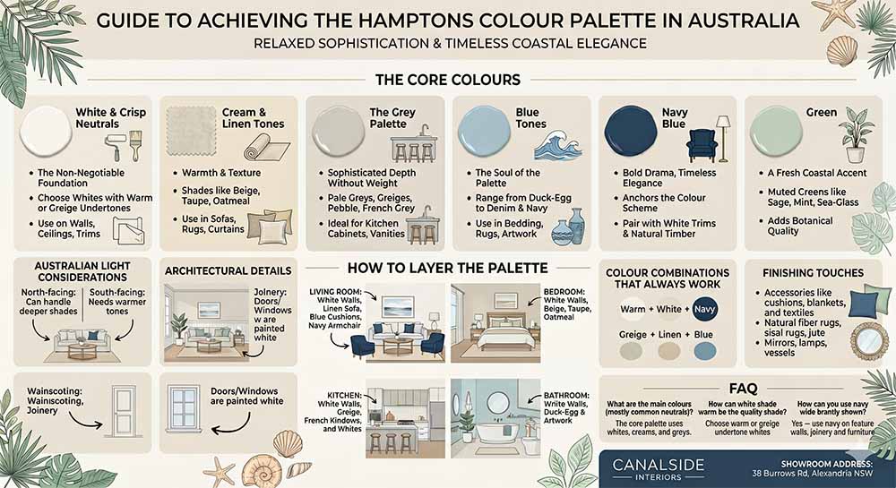
The Core Colours of the Hamptons Palette
1. White and Crisp Neutrals — The Non-Negotiable Foundation
White is the cornerstone of any Hamptons colour palette, but not all whites are created equal. The Hamptons look calls for a white that breathes — one with subtle warmth or a barely-there grey undertone. Stark, clinical whites are too harsh and will work against the relaxed, coastal feel you're aiming for. What to look for: Choose whites with warm or greige undertones — shades that carry a whisper of warmth rather than reading bright and stark.
Ask your local paint supplier for whites described as "natural," "half," or "warm white" and always test a sample first. Where to use white: Walls, ceilings, architectural trimmings, architraves, skirting boards, door frames, and cabinetry. ? Pro tip: Use slightly different white tones for walls versus trims to add depth. A warmer white on walls with a crisper white on skirting creates visual interest while keeping the palette cohesive.
2. Cream and Linen Tones — Warmth and Texture
Cream and linen tones are the workhorses of the Hamptons colour palette. Without them, white-dominant rooms can feel cold or sterile. These sandy, warm neutrals bring the palette to life by introducing an organic, earthy quality that anchors the room. Think of shades like warm beige, natural taupe, oatmeal, and sandy linen. These colours appear throughout Hamptons interiors in fabrics, upholstery, rugs, curtains, and soft furnishings.
- Sofas and armchairs in natural linen or cotton blend fabrics
- Curtains and window treatments — sheer linen panels are a Hamptons staple
- Bedroom bedheads and bedding
- Area rugs in jute, sisal, or woven cotton
- Cushions and decorative throws
| Explore our range of upholstered sofas and armchairs in cream and linen finishes. → Shop Hamptons furniture at Canalside Interiors |
3. The Grey Palette — Sophisticated Depth Without Weight
Greys in the Hamptons palette live firmly at the lighter end of the spectrum. Pale greys and greiges (a blend of grey and beige) add sophistication without heaviness. These light grey tones work beautifully on kitchen cabinetry — particularly when paired with white marble benchtops or classic splashback tiles. Recommended shades: Look for pale greys labelled "pebble," "French grey," or "greige" at your local paint supplier — shades with warm undertones that keep rooms feeling welcoming and light rather than cool and clinical. Where grey works best: kitchen cabinetry (especially island benches), bathroom vanities, feature walls in living areas, and upholstered furniture with grey-toned linen.
4. Blue Tones — The Soul of the Hamptons Palette
No Hamptons colour palette is complete without blue. It is the defining colour of the style — directly evoking the sea and sky that inspired the entire aesthetic. The beauty of blue in Hamptons design is its extraordinary range: from the palest duck-egg through to mid-range denim blues and all the way to deep, dramatic navy.
- Soft blues — walls in bedrooms and bathrooms for calm and serenity
- Mid-range blues — upholstery, rugs, curtain fabric for personality
- Accent cushions, throw pillows, artwork, and decorative vessels
- Bedroom bedding and quilts in classic blue and white stripe or geometric patterns
| For walls, opt for soft blue-grey or duck-egg tones labelled "spearmint," "duck egg," or "soft teal" at your paint supplier. → Browse armchairs and sofas in Hamptons-signature blue tones |
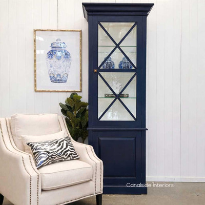
5. Navy Blue — Bold Drama, Timeless Elegance
Navy is the Hamptons palette's most dramatic player. When paired alongside crisp white trims, warm linen tones, and natural timber accents, it anchors the entire colour scheme with sophisticated authority. Navy in furniture: Our Peninsula Bedside in Navy and Peninsula 7-Drawer Chest in Navy are standout pieces that bring the navy element into the bedroom with serious style.
- Navy + crisp white = classic nautical
- Navy + warm linen + brass accents = coastal luxe
- Navy + pale grey + natural timber = relaxed coastal contemporary
| Discover our Peninsula Bedroom Range — available in white, navy, and navy with limewash top. → Shop the Peninsula range at Canalside Interiors |
6. Green — A Fresh Coastal Accent
Green is an often-overlooked but quietly important member of the Hamptons colour family. Pale, muted greens — particularly those with grey or blue undertones, such as mint, sage, and soft sea-glass green — add a fresh, botanical quality to the palette. Recommended paint: A soft spearmint or sage paint with grey undertones works beautifully — ask your paint supplier for something in the "sage," "sea glass," or "soft mint" family. For cabinetry, see our Grange 3-Door Wall Unit in Teal Green.
How to Layer the Hamptons Colour Palette
Understanding the individual colours is one thing — knowing how to layer them together room by room is what creates a truly cohesive Hamptons interior. Here's a practical approach for each space in the home.
Living Room: Start with white walls and crisp white trims as your canvas. Introduce a linen-toned sofa as the hero piece, then layer in blue through cushions, a patterned rug, and framed coastal artwork. A navy armchair adds drama and grounding, while natural timber accents in the coffee table or shelving bring warmth and stop the space feeling flat.
Bedroom: White bedding and walls form the calm base. Introduce a navy or blue-striped bedhead as the room's focal point, then style with layers of linen-toned cushions, a warm grey throw, and a pair of matching white bedside tables for symmetry and balance.
Kitchen: White upper cabinetry with soft grey or navy lower cabinetry creates the classic two-tone Hamptons kitchen. Finish with white marble or stone benchtops, splashback tiles in white or light grey, and blue-upholstered kitchen stools at the island for a polished coastal result.
Bathroom: White tiles and fittings form the clean foundation. A vanity in white or soft grey keeps things light, while a pale blue or sage green feature tile or painted wall adds a quiet coastal moment. Natural stone or limewash accents complete the look with texture and warmth.
Australian Light and Your Colour Choices
Australia's abundant natural light is one of the greatest assets when creating a Hamptons interior — but it also demands careful consideration. Our intense sunlight can bleach out very pale colours and exaggerate warm undertones. North-facing rooms: Can handle slightly deeper shades of grey and blue without feeling heavy. South-facing rooms: Need lighter, warmer tones to compensate for cooler, flatter light. Greige walls and cream furnishings will stop these rooms from feeling chilly. ? Pro tip: Always test paint samples across different times of day before committing. What looks perfect at 10am may feel flat by 4pm.
Architectural Details and the Colour Palette
The Hamptons colour palette extends beyond paint and soft furnishings — it flows through the architectural bones of the home. Wainscoting and wall panelling are quintessential Hamptons features, and the way they're finished is just as important as the panelling itself. Beadboard and tongue-and-groove panelling, almost always painted in a crisp white or warm off-white, add texture and visual depth to any room.
In a hallway or living room, wainscoting painted the same white as the skirting boards creates a cohesive, tailored finish that is unmistakably Hamptons. In a bathroom, white beadboard panelling paired with a soft blue or sage green upper wall is one of the most classic combinations the style offers. Joinery — including kitchen cabinetry, built-in shelving, and display units — is almost always painted in Hamptons interiors rather than left in natural timber.
White remains the dominant choice for upper cabinetry, while softer grey or navy makes a statement on lower cabinetry or island benches. Black joinery is used sparingly but effectively, particularly in bathrooms and kitchens where a contrast finish on tapware or handles adds a contemporary edge without disrupting the overall palette.
Doors and windows: French doors and plantation shutters are Hamptons staples, and painting them in a crisp white or a barely-there grey keeps them consistent with the broader palette. If you want to introduce a subtle colour moment, consider painting interior French door frames in a soft duck-egg blue or pale sage — it's a detail that reads beautifully against white walls without being obvious. ?
Pro tip: When painting panelling or wainscoting, use a semi-gloss or satin finish rather than flat — it's more durable in high-traffic areas and gives the architectural detail a subtle sheen that looks refined and intentional.
Colour Combinations That Always Work
If you're feeling unsure where to start, these tried-and-true Hamptons colour combinations take the guesswork out of the process:
- Warm white walls + white skirting + navy upholstery: The classic Hamptons combination. Simple, timeless, and endlessly adaptable.
- Greige walls + white trims + linen sofa + blue rug: Warmer and softer — ideal for south-facing rooms or cooler climates.
- White kitchen uppers + grey lowers + marble benchtop + white splashback tile: The definitive Hamptons kitchen formula. Add navy stools to complete the look.
- White walls + pale blue feature wall + linen bedding + rattan accents: A bedroom combination that feels like a boutique coastal retreat.
- Navy cabinetry + white walls + limewash top + brass hardware: A bolder Hamptons approach — particularly popular in master bedroom and study joinery.
Finishing Touches: Accessories and Colour Accents
Once your foundational palette is in place, it's the accessories that bring the scheme to life and give it personality. Cushions and throws are the easiest way to introduce or adjust colour — a set of navy blue-and-white striped cushions on a linen sofa instantly reads Hamptons. Swap them for pale duck-egg or sage green and the room shifts to a softer, botanical mood while staying firmly coastal.
Vessels, vases, and decorative objects in white, natural stone, aged brass, or coastal blue add the final layer of detail. Botanical artwork featuring coastal grasses, palm fronds, or Australian native flora bridges the gap between the Hamptons aesthetic and the local landscape beautifully. For rugs, choose natural jute or sisal in a linen tone, blue-and-white geometric or stripe patterns, or soft grey wool — and avoid bold, busy prints that compete with the room rather than supporting it.
Don't overlook mirrors and lighting as part of the colour palette story. A white-framed or natural timber mirror reflects light and adds architectural character, while linen or rattan pendant shades introduce texture without adding colour. Table lamps with warm-toned shades in cream or taupe reinforce the linen palette beautifully and keep the atmosphere relaxed and welcoming after dark.
FAQ — Frequently Asked Questions
Q: What are the main colours in a Hamptons colour palette? |
| A: The core Hamptons colour palette centres on soft whites, warm creams, light greys (often greige), and varying shades of blue — from pale duck-egg through to rich navy. These are typically supported by linen and taupe tones in soft furnishings, with occasional accents of green. |
Q: What shade of white is best for a Hamptons interior in Australia? |
| A: Avoid stark, bright whites — they feel too clinical. Choose whites with a touch of grey or warm undertone, often described as "natural white," "warm white," or "half white" at your local paint supplier. Always test samples across different times of day in your specific space before committing. |
| Q: Can I use navy blue in a Hamptons interior without it being too dark? |
| A: A: Absolutely. Navy is a staple of the Hamptons palette and works best when balanced with plenty of white and light neutrals. Use it on a feature wall, in upholstered furniture, or through accessories like cushions and artwork — the contrast with white trims is what gives it that classic nautical look. |
Q: What's the difference between Hamptons and coastal style in colour terms? |
| A: Hamptons style has a more refined, sophisticated palette — crisp whites, navy, and warm greys — whereas general coastal style can be more casual and may use brighter or more varied colours. Hamptons is a specific, classic subset of coastal design. |
Q: Is grey a Hamptons colour? |
| A: Yes, light grey is very much part of the Hamptons palette. The key is to choose soft, pale greys with warm undertones — or greige (grey-beige blends) — rather than deep or cool-toned charcoals. Grey is particularly popular for kitchen cabinetry and bathroom vanities. |
Q: How do I incorporate the Hamptons colour palette on a budget? |
| A: Focus on paint first — a fresh coat of soft white or warm grey makes an immediate impact. Then layer in blue and linen tones through cushions, throws, and soft furnishings. A blue-and-white striped rug or a set of navy cushions can transform a room. See our guide to affordable Hamptons style decor for more ideas. |
| Q: What colour should Hamptons kitchen cabinets be? |
| A: White upper cabinets paired with soft grey or navy lower cabinets is the most popular Hamptons kitchen combination. White marble or stone benchtops and a classic white splashback tile complete the look. |
Q: Can I blend Australian coastal style with the Hamptons palette? |
| A: Yes — and this is increasingly how Australians are approaching the style. You can bring in local materials (rattan, natural timber, linen) and reference the Australian landscape through botanical accents and slightly warmer, sun-bleached tones while maintaining the classic Hamptons white-and-blue framework. |
Bringing It All Together
The Hamptons colour palette is, at its heart, an exercise in restraint and balance. It asks you to resist the temptation to overcomplicate — and instead trust in the harmony of soft whites, warm neutrals, and coastal blues to create spaces that feel simultaneously sophisticated and deeply comfortable. When you get the palette right, the furniture, the architecture, and the day-to-day feel of your home all fall effortlessly into place around it.
Whether you're starting from scratch or refreshing an existing space, the key is to build from the foundation up: whites and linens first, then greys and blues, then navy and green as accents. Layer your soft furnishings thoughtfully, pay attention to how Australian light moves through your rooms across the day, and don't rush the process. The Hamptons look rewards patience and intention. Every colour decision you make is a step closer to a home that feels like a true coastal retreat — one that captures the breezy, sun-drenched elegance of seaside living, right here in Australia.
Whether you're after a full furniture refresh or just a few key pieces to tie the palette together, our team at Canalside Interiors is happy to help. We work with Hamptons-style interiors every day and genuinely love helping customers get the look right. Pop into our showroom at 38 Burrows Rd, Alexandria NSW, or browse our full range online. We're open seven days.
| → Browse the full Canalside Interiors Hamptons furniture range |